

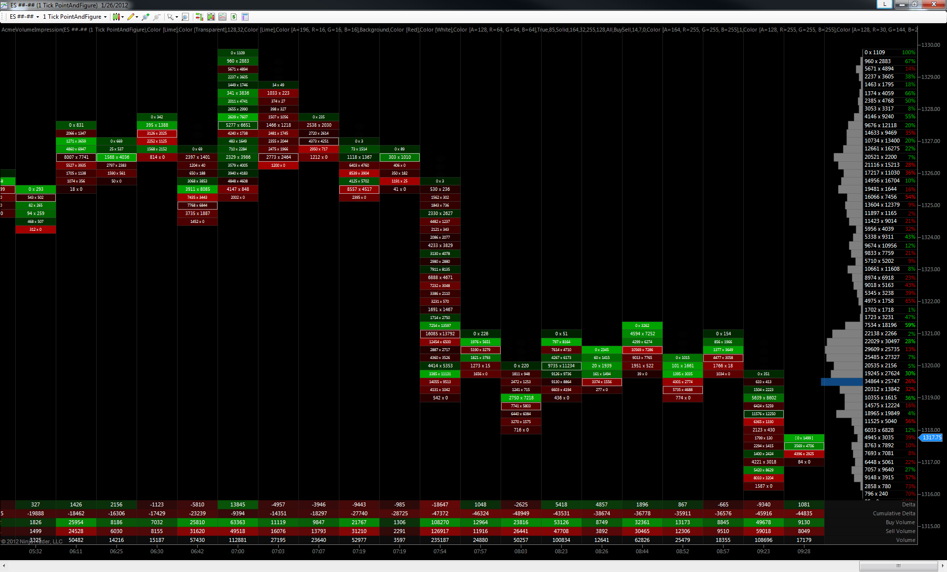
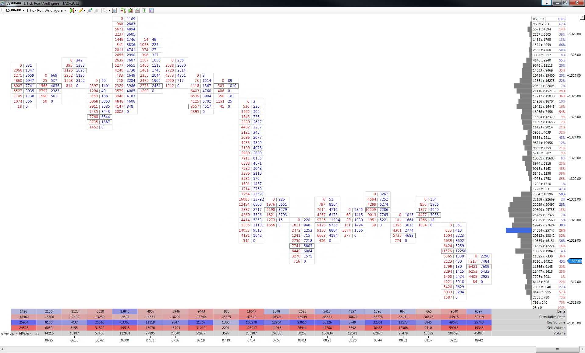
Volume Impression
The Volume Impression lends a ton of depth to the suite. Why? Well, impressions are one of the only ways you can really “see inside the bars.” Buying and selling pressure are much easier to spot when it’s right there in the numbers. The Volume Impression makes pressure imbalances obvious and precise where range and candle patterns can be ambiguous and even misleading.
The Volume Impression really is the perfect compliment to the Volume Profile and Volume Breakdown studies.
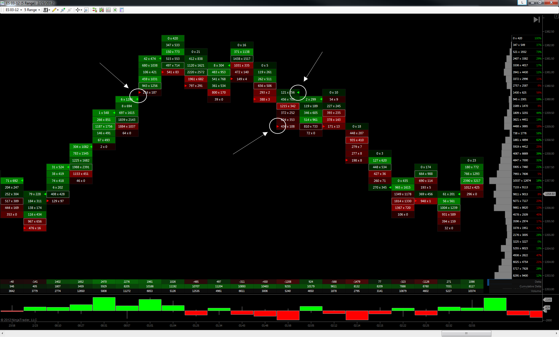
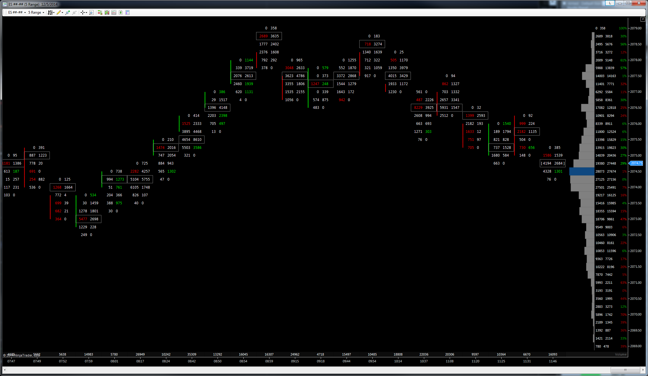
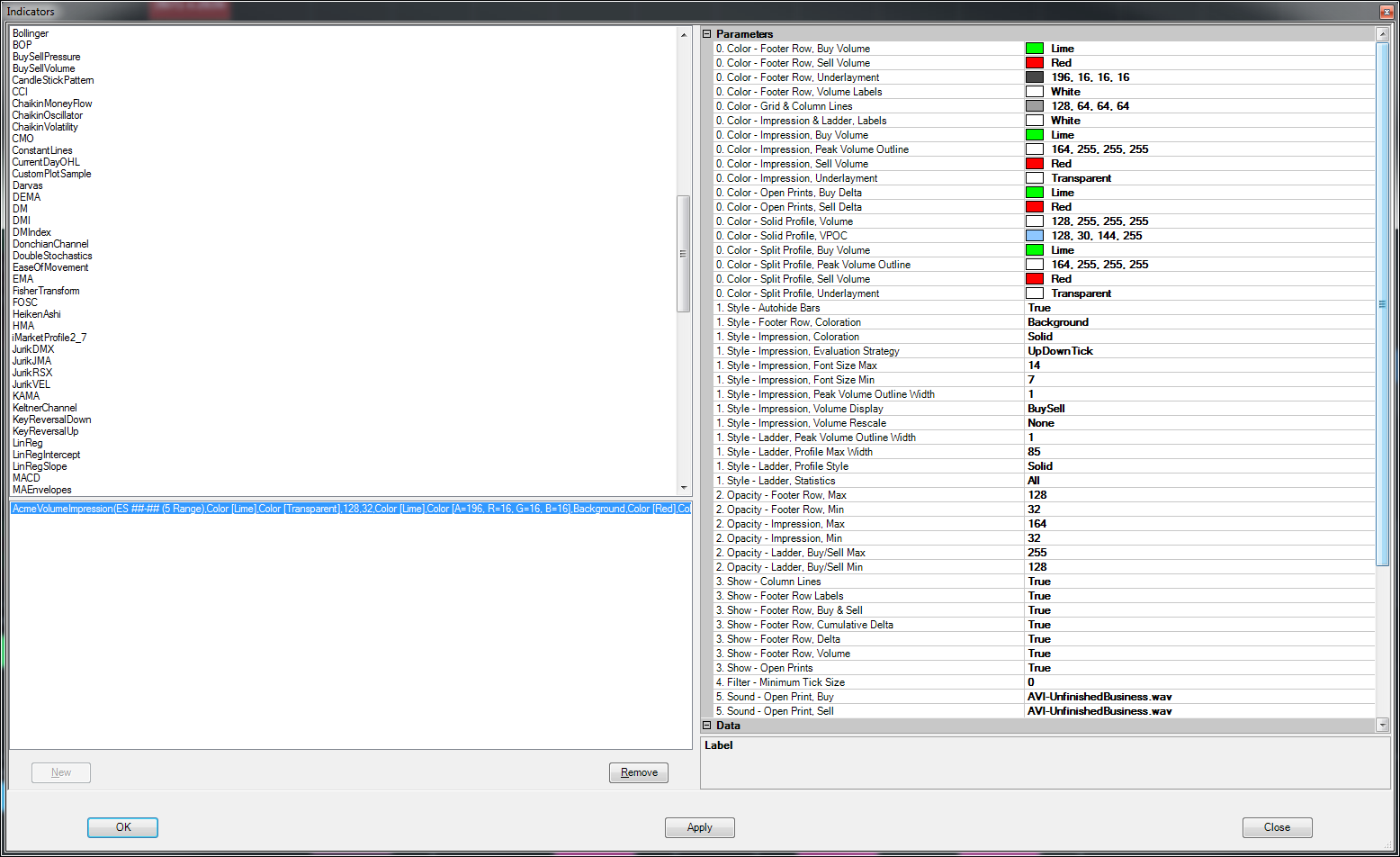
This one has most everything you’d expect of a top-notch volume analysis chart. Commonly described as a “footprint chart” (see bottom of page) the AVI’s design focuses on clarity and simplicity with the goal of supporting very quick trading decisions. Moreover, it is very flexible in terms of look and feel and you can configure it to match pretty much any visual style you can dream up in Ninja.

Basic Anatomy of the Volume Impression
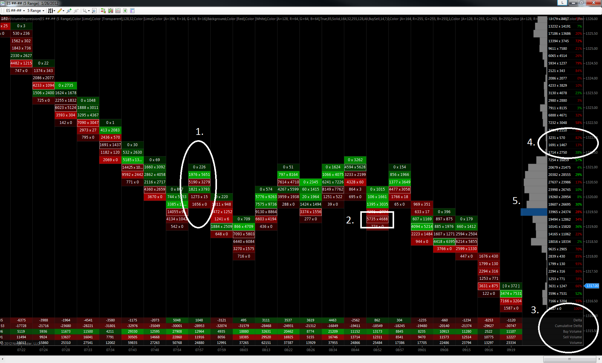
1. Bar Breakdown
The selling vs buying order flow activity in the bar for each price in the bar, selling on the left of the “x”, buying on the right. Bar prices are colored according to the relative strength of the buying or selling activity in that bar. The more intensely-colored prices are, the more imbalanced the buying or selling was at that price relative to the other prices in that bar.
2. High-Volume Price
The price in the bar that had the most activity, either buying or selling. If this bar were profiled, this would be the volume point-of-control or VPOC.
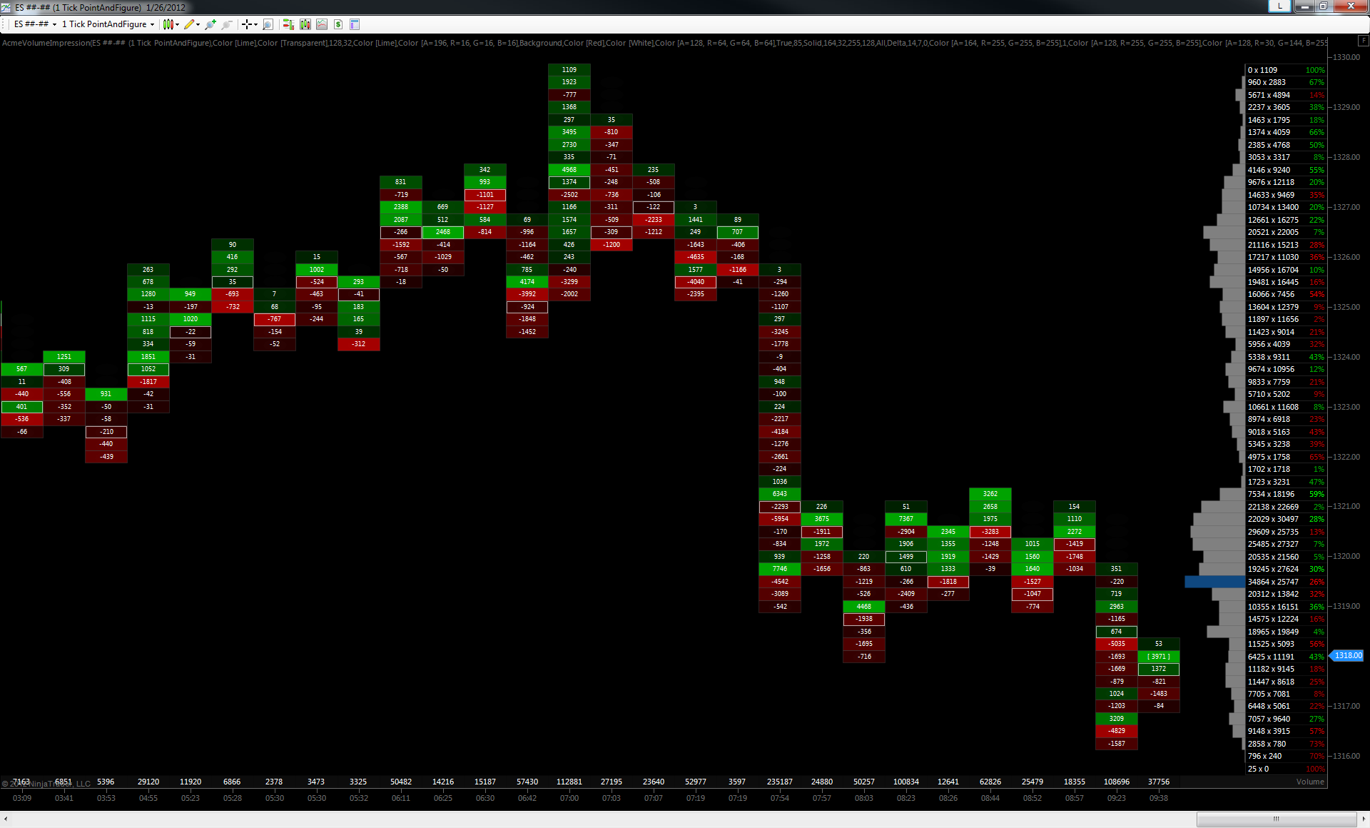
3. Bar Footer Rows
The totals of the order flow activity shown in the bar breakdown.
- Delta: The total difference of buying and selling in that bar. Positive numbers indicate excess buying, negative numbers indicate excess selling.
- Cumulative Delta: An accumulation of the Delta values. That is, when read left to right, the Cumulative Delta row shows excess buying or selling across the session. Again, positive numbers indicate excess buying, negative numbers indicate excess selling.
- Buy Volume: The total order flow activity determined to be buying for that bar.
- Sell Volume: The total order flow activity determined to be selling for that bar.
- Volume: The total volume traded in that bar.
4. Session Price Ladder
Shows the total selling vs buying for that price for all bars in the session.
- ##### x #####: Selling volume vs buying volume for that price across the session.
- ###%: The difference between the session selling and buying volume for that price, expressed as a percentage for at-a-glance reference. Colors indicate negative or positive order flow imbalance, negative being selling and positive percentages indicate an imbalance of buying at that price for the session.
5. Session Profile
The relative volume of trades at each price for the session displayed as a histogram (a.k.a profile). Longer bars indicate more volume, shorter bars indicate less volume traded at that price for that session.